Year in Pixels, Explained: How to Read a Whole Year of Moods

The MoodKit Team
· 4 min read
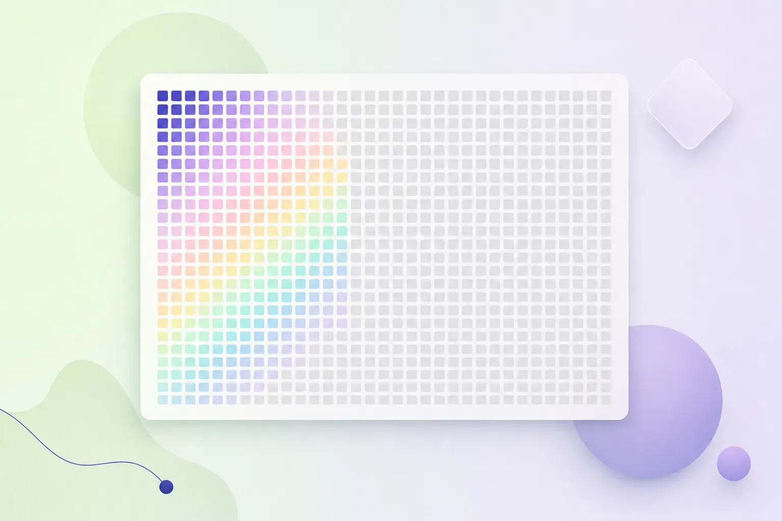
Somewhere in a bullet journal around 2016, someone drew a grid (12 columns for months, 31 rows for days) and started coloring one tiny square each evening based on how the day felt. The Year in Pixels spread out from there to every mood app worth using, because it solves a problem nothing else solves as elegantly: a year of feelings, visible in one glance.
This is the full guide: why the grid works, how to actually read one, and the least-effort ways to keep one in 2026 (including, disclosure, in MoodKit, which we build).
Why one picture beats a hundred charts
A daily mood log is truthful and useless in the moment; each entry is a pixel-sized fact. Line charts summarize but smooth away texture. The pixel grid does something different: it keeps every single day and shows the whole year, simultaneously.
That’s why patterns you’d never articulate jump out of a grid: the grey band across February, the good streak that started when the job changed, the reliably rough first week of every month. Zoomed out, your moods have weather systems. The grid is the satellite view.
There’s also the quiet motivational trick. An empty square tomorrow is mildly unbearable in a way “keep your streak” notifications never quite manage. People who abandon every other tracking format sometimes keep coloring squares for years.
How to read your grid
Give it three weeks minimum, then look for five things:
- Clusters. Bad days rarely arrive solo. A clump of low-color squares points to an episode with a start date, and start dates have causes you can hunt.
- Stripes. Vertical-ish repetition at weekly rhythm means a weekday pattern — the Sunday dread column, the Wednesday slump. (Your calendar is doing this to you, and your tracker can name the day.)
- Seasons. Compare quarters at arm’s length. Many people’s grids visibly dim in deep winter or heat waves; seeing it plainly is the first step to planning around it.
- Transitions. Find the date a life change happened (new job, moved flat, breakup) and read the colors before and after. The grid is brutally honest about what changes actually changed.
- Blanks. Missing squares cluster too, and the clusters usually mark your overwhelmed stretches. The gaps are data about the logging habit itself — the fix is less friction, not more discipline.
One reading rule: the grid raises questions, it doesn’t answer them. “Why was late June grey?” needs the context layer — what you were doing those days — which is exactly what activity tags exist for. A grid plus tags can be interrogated; a grid alone can only be admired.
Keeping one: paper vs apps
Paper is the original and still lovely: a notebook page, a five-color key, one square each evening. Costs nothing, needs no battery, and the tiny ritual of choosing the color is genuinely pleasant. Its limits: no reminders, no timestamps, and every pattern-read is manual highlighter work.
Apps color the square from your normal mood log, so the grid becomes a free byproduct of tracking you’d do anyway. The field is covered in our Year in Pixels apps round-up; the short version:
- Pixels is the dedicated specialist, essentially a one-time ~$4.99.
- Daylio includes a grid among its stats.
- MoodKit draws the grid from your one-tap check-ins and puts it where no other established tracker does: a full Year in Pixels Home Screen widget (iOS 17+), updating as you log. Your year stares back every time you unlock — which, for the empty-square motivation trick, is the maximum-strength dose.
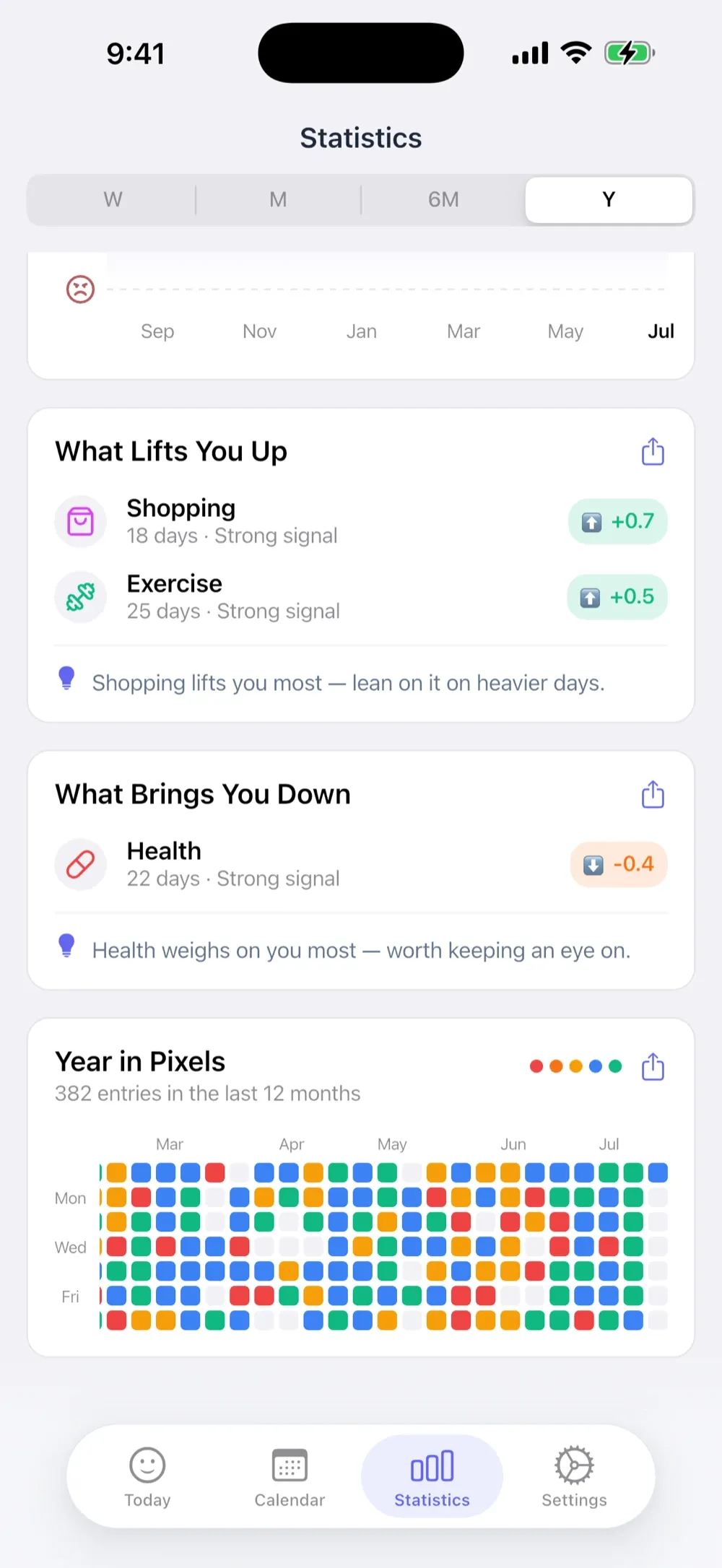
MoodKit also closes the “grids raise questions” loop: the same entries feed ranked mood drivers, weekday rhythms, and self-experiments, so when the grid shows a grey stretch, the why is one tap deeper. (Trial first, then $39.99/year or a one-time $79.99 Lifetime. iPhone and iPad.)
Start mid-year anyway
The classic mistake is waiting for January 1st, as if partial grids don’t count. A grid started in August still shows clusters by September and stripes by October. Five colors, one honest square a day, blanks left blank. That’s the entire craft — and by New Year’s you’ll own the rarest kind of year-in-review: one made of actual days instead of vibes.
Frequently asked questions
What is a Year in Pixels?
A grid with one small colored square per day — usually 12 columns of up to 31 squares — where each color represents that day's mood. A full year becomes one picture, which makes long-range patterns visible in a way daily logs never are.
Where did the Year in Pixels come from?
The bullet-journal community, around 2016, as a hand-drawn spread. It spread because it solved a real problem beautifully: paging back through a diary hides patterns that a single grid reveals instantly.
How many mood levels should a pixel grid use?
Five is standard and plenty: distinct colors stay readable at one-square-per-day size, and a five-level scale is fast to answer honestly every evening. More levels make prettier legends and muddier grids.
What if I miss days in my Year in Pixels?
Leave them blank rather than guessing — backfilled squares poison the picture. A few gaps don't hurt; the grid's patterns survive missing data. Apps with reminders and one-tap logging keep gaps rare.
Keep reading
Best Year in Pixels Apps in 2026 (And the Only Widget Version)
Every good way to keep a Year in Pixels in 2026: the dedicated apps, the trackers with built-in grids, the only Home Screen widget, and the paper original.
· 4 min read

How to Track Your Mood: The Complete 2026 Guide
A practical system for mood tracking that survives real life: picking a scale, tagging context, staying consistent, reading patterns, and testing changes.
· 5 min read

Best iPhone Mood Tracker Widgets in 2026 (Home & Lock Screen)
Which mood trackers actually ship useful iPhone widgets in 2026 — one-tap logging, streaks, and Year in Pixels grids — and which big names still have none.
· 4 min read